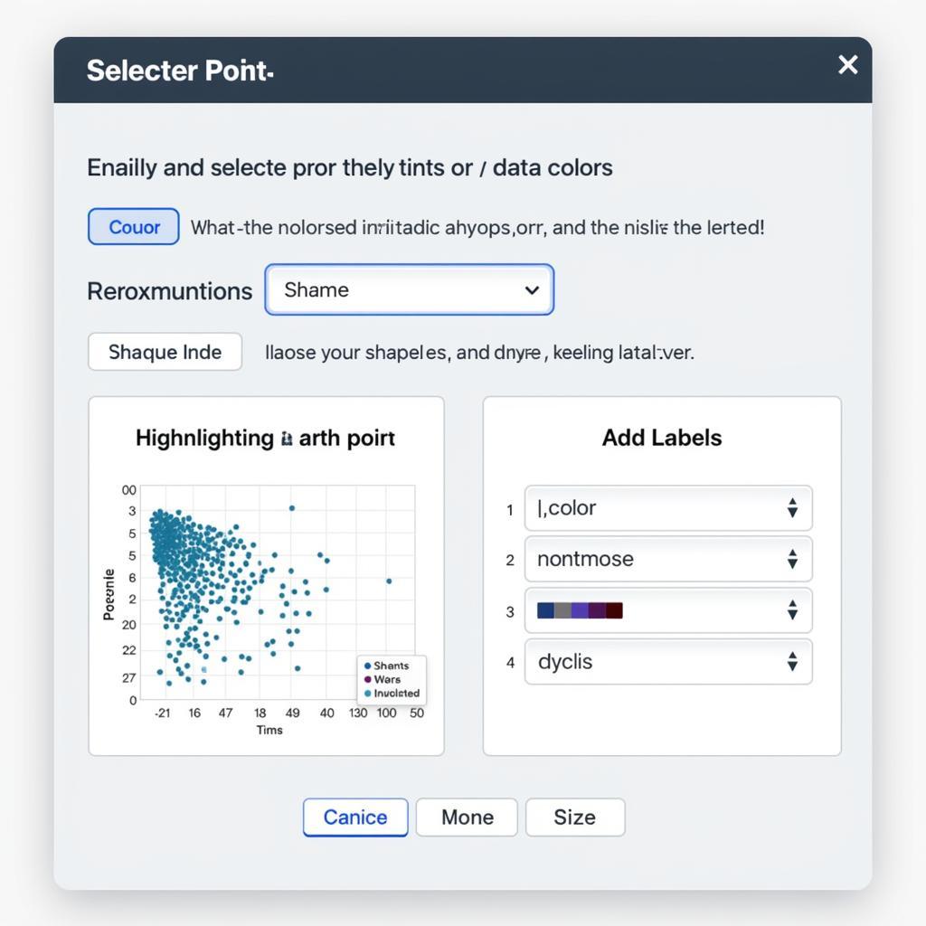
Scatter graphs are powerful tools for visualizing relationships between two variables. But sometimes, you need to emphasize specific data points within the vast sea of dots. This article will delve into various methods for effectively highlighting a spot in a scatter graph, allowing you to draw attention to key insights and enhance your data storytelling.
Pinpointing Key Data: Highlighting Specific Points
Highlighting a single point or a group of points in a scatter graph can drastically improve its communicative power. Whether you’re showcasing outliers, significant trends, or specific data subsets, mastering this technique is crucial for effective data visualization.
Using Color to Draw Attention
One of the simplest yet most effective ways to highlight a spot is by using a contrasting color. If your graph primarily uses blue dots, consider highlighting the chosen point with red, orange, or green. This visual distinction immediately draws the eye to the area of interest.
Changing Marker Shape and Size
Modifying the shape or size of the highlighted spot is another effective strategy. For instance, you can use a star, diamond, or square to represent the highlighted point while the rest remain as circles. Increasing the size of the chosen point also makes it stand out.
Adding Annotations and Labels
For added clarity, consider annotating the highlighted point with a label or a short description. This is particularly useful when presenting to an audience or when the graph needs to be self-explanatory. This technique can quickly tell the viewer what it represents, adding context to the highlighted data point. For instance, you could highlight a data point representing a specific product launch and label it accordingly.
Utilizing Software Features
Many data visualization tools offer built-in features specifically for highlighting data points. These features often allow for dynamic highlighting, allowing users to interact with the graph and explore the highlighted points in more detail. This interactive highlighting is handy in dashboards and presentations.
 Sử dụng phần mềm để làm nổi bật điểm dữ liệu
Highlighting Data in Different Software
Each software package offers unique ways to highlight data. From Excel to specialized data visualization tools like Tableau or Power BI, understanding these nuances can streamline your workflow. It’s almost like learning a new football tactic for each team you manage! You adapt and optimize your strategy based on the available players and resources.
Excel: Conditional Formatting and Chart Tools
Excel provides options like conditional formatting to highlight points based on specific criteria. You can also use the chart tools to manually change the appearance of individual data points. This allows for precise control and customization.
Tableau and Power BI: Interactive Highlighting
Tableau and Power BI excel in interactive data visualization. These platforms offer powerful tools for highlighting data points based on filters, selections, and other interactive elements. This creates a dynamic and engaging experience for the viewer.
Highlighting for Impact: Best Practices
Highlighting is not just about making a point stand out; it’s about conveying a clear message. Consider the following best practices for maximizing the impact of your highlighted data:
- Purposeful Highlighting: Only highlight data points that are truly significant to your narrative. Over-highlighting can dilute the impact and make the graph less readable.
- Context is Key: Provide sufficient context to explain why the highlighted point is important. Don’t leave your audience guessing about its significance.
- Consistency Matters: Maintain consistency in your highlighting techniques throughout your presentation or report. This ensures a cohesive and professional look.
Conclusion
Highlighting a spot in a scatter graph is a crucial skill for effectively communicating data insights. By employing the techniques outlined in this article, you can transform your scatter graphs from simple data displays into compelling visual narratives. Whether you use color, shape, annotations, or software-specific features, remember to highlight with purpose and context to make your data truly shine. For any assistance, please contact us at Phone Number: 0372999996, Email: [email protected] or visit our office at 236 Cau Giay, Hanoi. We have a 24/7 customer service team.
FAQ
- What is the best way to highlight multiple points in a scatter graph?
- Can I highlight points based on specific criteria in Excel?
- How do I add annotations to highlighted points in Tableau?
- What are some common mistakes to avoid when highlighting data points?
- How can I make my highlighted data points more accessible to viewers with visual impairments?
- What color combinations work best for highlighting data points?
- Are there any free tools available for creating and highlighting scatter graphs?
Tương tự như highlight y-value google drive spreadsheet, việc làm nổi bật dữ liệu trên biểu đồ cũng giúp dễ dàng nhận biết các giá trị quan trọng.
Điều này có điểm tương đồng với unity specular highlights smoothness khi cả hai đều tập trung vào việc làm nổi bật các yếu tố cụ thể để tăng cường hiệu quả hiển thị.