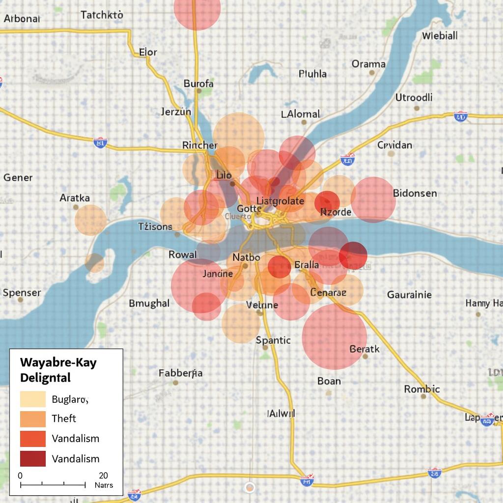
ArcGIS, the leading Geographic Information System (GIS) platform, offers a wealth of functionalities for visualizing and analyzing spatial data. One of its most compelling features is the ability to highlight selected features in various shapes, providing a powerful and versatile way to communicate insights and tell stories with data. This capability allows users to focus attention on specific areas of interest, emphasize trends or patterns, and enhance the overall impact of their maps.
Understanding the Power of Feature Highlighting
Feature highlighting in ArcGIS goes beyond simple visual selection. It offers a dynamic approach to map design, allowing users to create visually appealing and informative representations of data. By using different shapes to highlight features, users can:
- Enhance Clarity: Different shapes can be used to distinguish various categories or types of features, making it easier for viewers to understand the map’s message.
- Emphasize Trends: Highlight features with specific characteristics, such as high crime rates or areas with high population density, to bring attention to important patterns.
- Tell Compelling Stories: Use shapes to create visual narratives, guiding viewers through the data and highlighting key insights.
- Boost Engagement: Eye-catching shapes can make maps more visually appealing, capturing the viewer’s attention and encouraging deeper exploration of the data.
Exploring the Different Shape Options in ArcGIS
ArcGIS offers a wide range of options for highlighting features, allowing users to tailor their maps to specific needs and visual preferences. Here are some common shapes used for feature highlighting:
- Circles: Circles are a classic choice for highlighting features, providing a simple and effective way to draw attention to specific locations. They can be scaled to represent data values, creating an intuitive visual representation of magnitude or intensity.
- Squares: Squares offer a more geometric and structured approach to highlighting features. They can be used to represent distinct categories or areas with defined boundaries.
- Triangles: Triangles can add a sense of direction or movement to highlighted features, particularly when used to indicate flow patterns or directional data.
- Custom Shapes: ArcGIS allows users to create and import custom shapes, enabling even greater flexibility in visual communication. This opens up possibilities for unique and creative map designs.
The Importance of Choosing the Right Shape
The choice of shape for feature highlighting is crucial for creating effective and impactful maps. Consider the following factors when selecting a shape:
- Context: The shape should align with the type of data being visualized and the intended message. For example, using circles to highlight population density makes intuitive sense.
- Clarity: The shape should be easily recognizable and interpretable, allowing viewers to understand the map’s meaning without confusion.
- Visual Hierarchy: Consider the overall visual impact of the shapes used. Using contrasting colors and sizes can help create visual hierarchy and guide the viewer’s attention.
- Target Audience: The chosen shape should resonate with the target audience, taking into account cultural and demographic considerations.
Optimizing Feature Highlighting for Enhanced Visual Appeal
To maximize the effectiveness of feature highlighting in ArcGIS, follow these best practices:
- Color Selection: Choose colors that contrast with the background map and highlight the key features effectively. Consider using a color palette that aligns with the map’s theme or specific data categories.
- Transparency: Adjust transparency levels to control the visibility of highlighted features, ensuring they don’t obscure underlying map elements.
- Scaling and Sizing: Use different sizes to represent data values or to create visual emphasis on specific features.
- Labeling: Provide clear and concise labels to identify highlighted features and provide additional context.
- Dynamic Updates: Consider using interactive features to allow users to select and highlight features dynamically, enhancing their exploration of the data.
Real-World Examples of Feature Highlighting in ArcGIS
“
“
Unlocking the Potential of ArcGIS for Visual Storytelling
Feature highlighting is a powerful tool in ArcGIS for transforming data into engaging and informative visualizations. By carefully selecting shapes, colors, and other design elements, users can craft maps that tell compelling stories, highlight key insights, and inspire action.
FAQ
Q: What are some other ways to highlight features in ArcGIS besides using shapes?
A: In addition to shapes, other methods for highlighting features include using different colors, sizes, transparency levels, or applying dynamic effects like flashing or pulsating.
Q: Can I use feature highlighting to represent different categories of features?
A: Yes, you can use different shapes and colors to differentiate between various categories of features, making it easier for viewers to understand the map’s message.
Q: How can I create custom shapes for feature highlighting in ArcGIS?
A: ArcGIS provides tools to create custom shapes using polygons or by importing external shapefiles. You can also search for and download pre-made shapes from online resources.
Q: What are some resources available for learning more about feature highlighting in ArcGIS?
A: There are numerous online resources available, including ArcGIS tutorials, documentation, and community forums, that can provide detailed information and examples of feature highlighting techniques.
Q: Is feature highlighting suitable for all types of maps?
A: Feature highlighting is particularly effective for maps that focus on specific areas of interest, highlight trends, or communicate insights about spatial data. It may not be appropriate for maps that prioritize detailed geographic representation or visual aesthetics over data analysis.
Q: How can I ensure my feature highlighting is accessible to users with visual impairments?
A: Use sufficient contrast between colors and shapes, provide clear labels and alternative text descriptions, and consider utilizing accessibility features offered by ArcGIS to create maps that are inclusive for all users.